
Beauty is in the eye of the beholder. Somehow though, someone in the Boston Red Sox organization decided that there was beauty in this uniform design?!!?!

The above is the jersey worn by the Red Sox ever since 2021 when MLB introduced the City Connect jerseys throughout baseball. The Red Sox wear these yellow and blue uniforms whenever they are home on Saturday’s. The “inspiration” for these tweety bird outfits, was to connect the team to the iconic Boston Marathon, which is held each year on the third Monday of April, on what is known as Patriot’s Day.
Per MassLive.com the Red Sox put out this official statement upon the jersey’s debut in 2021 that explained how this design came about, “The City Connect uniform adopts colors that honor the spirit of Patriots’ Day weekend, and features ‘Boston’ in a stencil font across the chest paying tribute to the Boylston Street finish line”. Furthermore, Red Sox chief marketing officer Adam Grossman said at the time that the use of yellow represented the city’s “boldness”.
Pointing out the obvious regarding this color scheme, it was noted elsewhere that “many MLB fans and baseball purists have been vexed by the team’s alternate look. The team is named (after all) the Red Sox”.
Count us here at BP as also being “vexed” over this choice of colors. What was the choice to design a jersey for a team never previously associated with yellow and leave out its main color of red? The logic used by the Red Sox chief marketing officer is a curious one, since none of us here at BP has ever previously equated yellow with boldness, so we took a quick trip through the internet to see if such a connection exists. Here we found one color chart that seems fairly representative of linking colors to emotions and feelings.
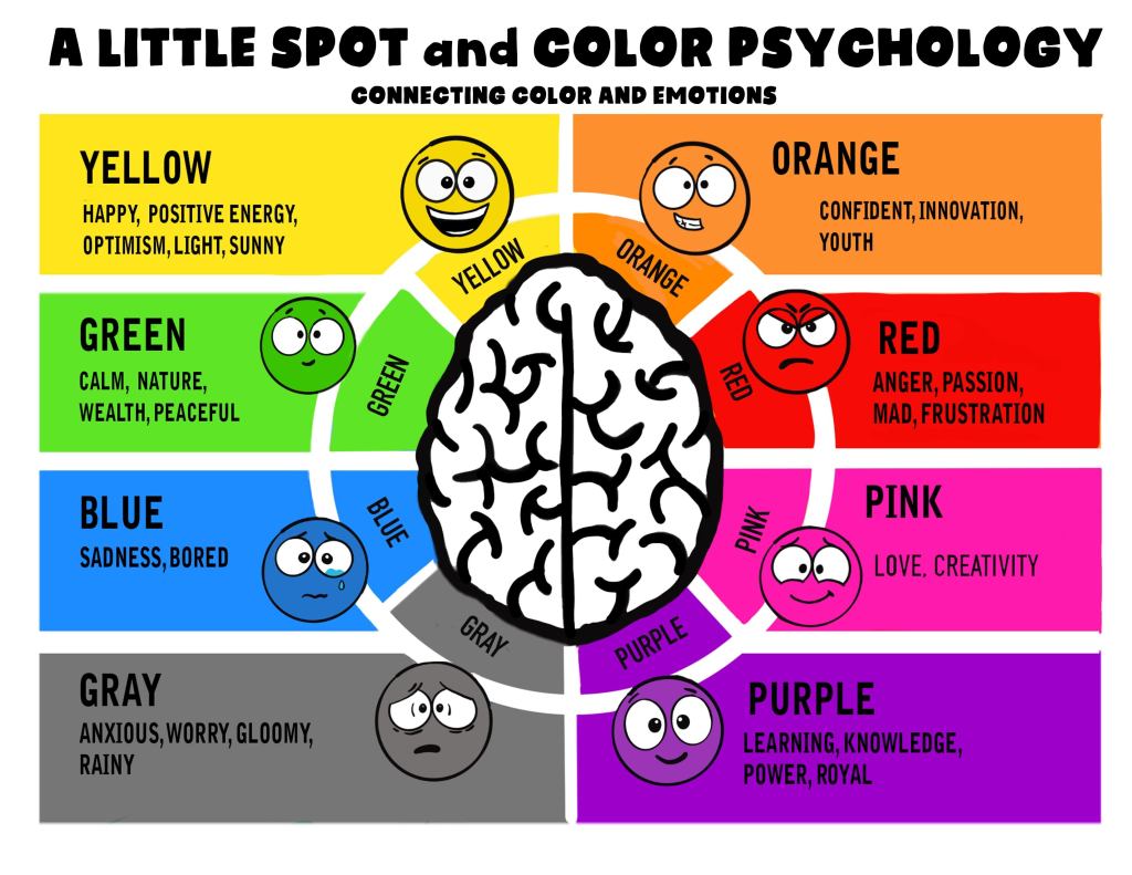
Okay, so no boldness associated with any color at least here and any of the other color charts that we could find online. We then decided to turn to AI to ask the very straightforward question, “What color represents boldness?”
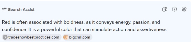
It is not that surprising that our AI search ended up associating red with boldness. Interestingly enough AI cited Trade Show Best Practices and an appliance retailer (Big Chill) in reference to their refrigerator line.
Therefore, the Red Sox marketing department did not have to look for a color that conveyed boldness by going against their traditional color scheme. All they had to do was consider their name or decide to shop for a refrigerator at Big Chill to determine they already had a bold color in their uniform.
The yellow Red Sox uniform is definitely not the worst in baseball history and there are many contenders for awful jerseys out there, but not only is this one heinous in our opinion, but goes against the traditional color scheme most everyone equates with the Boston Red Sox.
It probably should not come as any surprise that we here at BP favor the classic uniforms that team’s wear, and especially for such a storied franchise as the Boston Red Sox.
Because after all this……

Or this…..

Certainly beats this….

Believe it or not we have more to say about the Boston Red Sox jerseys, which we will cover in the near future here at BP.


Leave a reply to BP Cancel reply